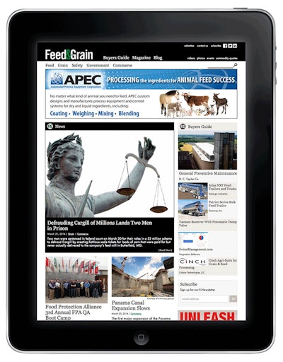
You may have noticed over the past several days that one of your favorite bookmarks on your web browser looks a little different. That's becauseFeed & Grainlaunched a new website earlier this week. This makeover has been months in the making, but after a few days of testing and tweaking, we're ready to announce it: The newFeedandGrain.comis live!
Our site retained many of the features it's known for, like ourDTN Commodity Quotespage, our expansiveOnline Buyers Guide, and a steady stream ofnewsupdates relevant to your daily lives as grain and/or feed handlers. But the look is notably different, fresh and cutting-edge. From day one, when our web designer asked the staff what we wanted most out of our new site, it was easy to answer him: make it simpler. From the color scheme, to its seamless display on mobile platforms, to the streamlined homepage, I think we've achieved just that.
Now, if you've ever participated in launching or re-launching a company website, you know it's never as cut-and-dried as anticipated. Some of the pages are still being enhanced or modified, and we ask for your patience while we work out those features. But in the meantime, there is plenty to love about the new site:
- It's easier to navigate
We boiled down our main navigation to the top five news topics that drew people in to FeedandGrain.com. They are: Feed, Grain, Safety, Government and Commerce. Search within these sections to hone in on the news that matters most to you.
- It looks great on your smartphone
In digital jargon it's called "responsive design," but all it means is that you can view FeedandGrain.com on your desktop, laptop, smartphone, or any size tablet and it looks like it was built especially for that device. No more limitations from a mobile-specific site with hard-to-read text ads. You now have access to all of our content anywhere at any time.
- You can be a part of our Blog
The feed and grain industry is a tight-knit community with unique challenges and experiences that only others like you can truly appreciate. We know how important it is for you to stay in touch and communicate your successes, ideas and opinions with eachother, as evidenced by our growing social media following. So, we'd like to extend an opportunity to our readers and industry suppliers to blog for FeedandGrain.com and share your perspective with your peers. Whether you're interested in contributing on a regular basis or making a single guest entry, go to theBlogpage and click the "Be part of our blog" button for more information.
- The new and improved Buyers Guide
Feed & Grainhas the most comprehensive online Buyer's Guide in the feed and grain industry, thanks to new entries being added on a weekly and sometimes daily basis. Carrying the simplicity theme to our BG, this section is easier than ever to navigate between company, product and category information. Bigger pictures and a more user friendly information request form enhance the shopping experience for interested buyers.
- Better looking ads
We know you visit FeedandGrain.com for its breaking news, magazine articles, product information and blogs, but we're also excited about the new attractive and easy-to-read digital ads. To avoid a cluttered layout, we've reduced the number of online ads, but they're larger to fit more information and can scale down or up for viewing on any platform.
I welcome your feedback on the site's new features. You canemailme, or tell us your thoughts onFacebookorTwitter. Have fun exploring the new FeedandGrain.com!


